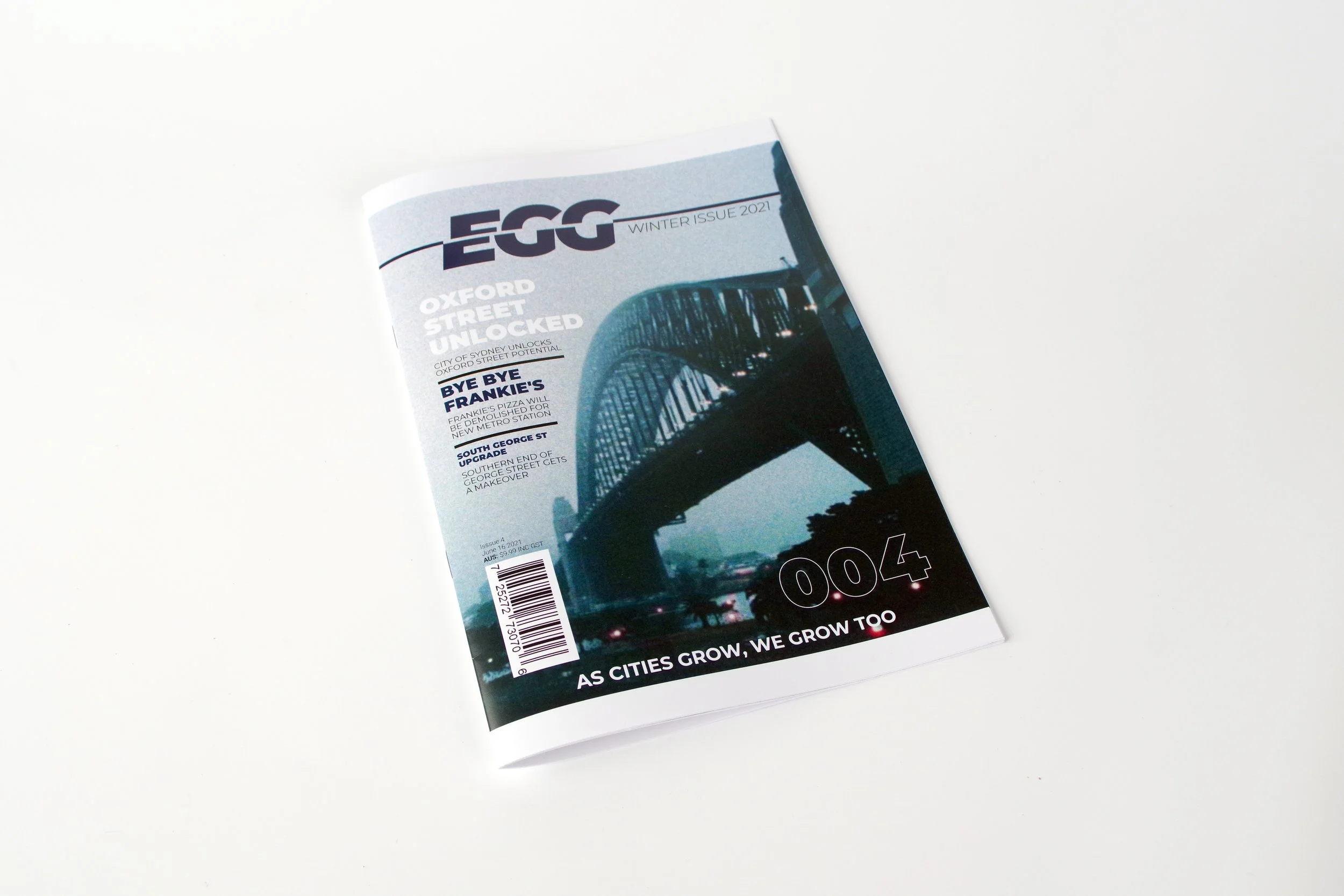
Egg Magazine
These works were created for an assignment during my studies at the Design Centre Enmore. The brief required us to conceptualise and design a fictional magazine on a subject of our choosing, covering everything from brand identity and layout to editorial design. For my project, I chose to focus on infrastructure, specifically highlighting various large-scale projects taking place in the Sydney area.
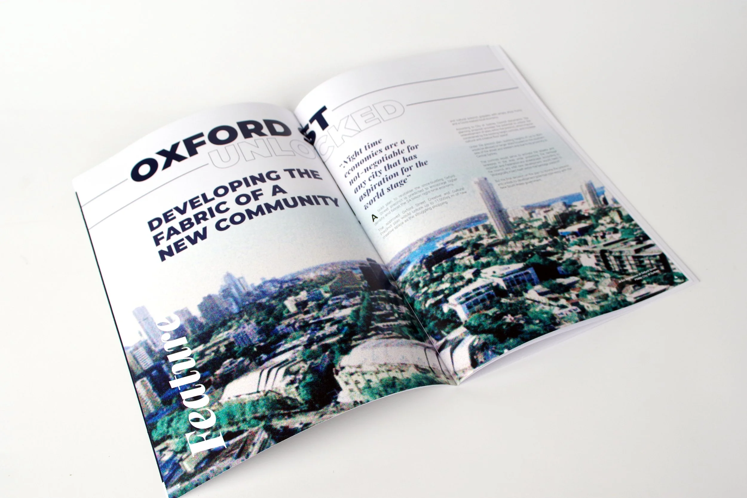
The goal was to design a publication that felt contemporary, professional, and engaging while maintaining clarity and accessibility for readers. I developed the magazine’s name, branding, and overall visual style, and applied these consistently across the cover, feature spreads, and supporting articles. The layouts combined strong typographic hierarchies, grid-based structure, and carefully chosen imagery to balance visual impact with readability.
This project allowed me to explore the full editorial design process—researching subject matter, establishing a tone of voice, creating visual consistency, and ensuring each spread communicated information clearly. It was also an opportunity to refine my skills in typography, layout design, and brand cohesion while producing a polished publication that could realistically sit on shelves alongside professional magazines.